
 Substack
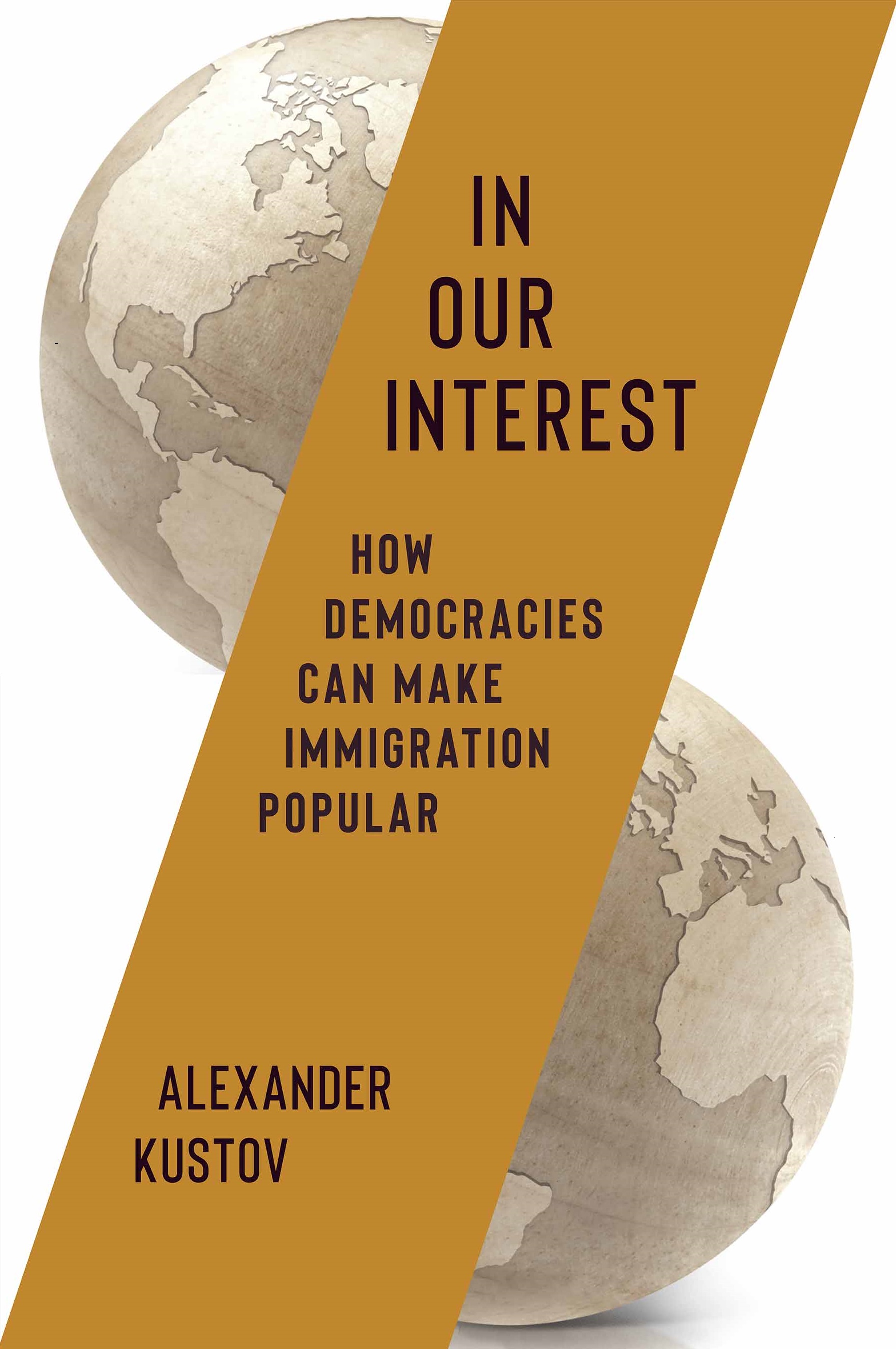
Cover Image Creation Brief
Cover Image Creation Brief
I have attached 6 images. Each is the real thumbnail/hero image from one of my articles in a major publication. I need you to turn each into a magazine-cover-style graphic for my website.
CRITICAL: You MUST use the 6 attached images as the backgrounds. Do NOT generate new illustrations or photos. Crop/zoom each attached photo to fill a 600x800 portrait frame, then overlay text on top of it.
Specs for ALL 6 covers
- Dimensions: 600 x 800 pixels (portrait / 3:4 ratio)
- Format: PNG
- Process for each: Take the attached image, crop/zoom it to fill the portrait frame (the originals are landscape — pick the most interesting region). Then overlay:
- A dark semi-transparent gradient rising from the bottom (~40%) for text legibility
- The publication name/wordmark at the top
- The article title in bold white text in the lower third (each title appears ONLY ONCE — never repeat or rephrase any part of the title)
- Style: Clean, editorial, professional. Each cover should look like a real cover from that publication.
Image 1 (the illustration with hands) → The Atlantic
- Branding at top: “The Atlantic” in its signature red color, centered, serif font
- Title (print exactly this, once): The Pro-Immigrant Case for Opposing Illegal Immigration
Image 2 (the crowd/protest photo) → Foreign Affairs
- Branding at top: Navy blue banner with “Foreign Affairs” in white serif text
- Title: How to Win on Immigration
Image 3 (the colorful graphic with figures and charts) → Reason
- Branding at top: “reason” in lowercase modern sans-serif
- Title: The Formula for Making Immigration Popular
Image 4 (the San Antonio memorial photo) → The Washington Post
- Branding at top: “The Washington Post” in Old English/Gothic font in white, then “The Monkey Cage” in small text below
- Title: Immigration Opponents Are Far More Passionate Than Supporters
Image 5 (the US/Europe comparison graphic) → The Argument
- Branding at top: “The Argument” in bold modern sans-serif
- Title: Why America Is So Much Better Than Europe at Immigration
Image 6 (the megaphone illustration with geometric shapes in muted greens/browns) → Popular by Design
- Branding at top: “POPULAR BY DESIGN” in all caps, bold, condensed sans-serif (similar to Bebas Neue or Knockout — very tall, narrow, tightly tracked black letters). This is a Substack newsletter masthead.
- Title: The Uncomfortable Truths About Immigration
Reminders
- USE THE 6 ATTACHED IMAGES as backgrounds — do NOT create new images
- Each title appears exactly ONCE — do not duplicate, rephrase, or split any title
- Dark gradient overlay from the bottom is essential for text readability
- Generate all 6 as separate images